Our webpages have a fixed set of elements, such as a header, footer and form components. This section lists what properties of each element are customisable.
The font family and text colour of your choice is set as the default for all text on the page. Optionally, you can include a fallback font family. On top of this, text can be styled differently for almost every type of UI element.
Our webpages are responsive. Check our example pages to see how our pages and UI elements react to different screen sizes and to user interactions.
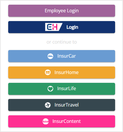
InsurGroup, a UI for employees of a fictitious company (segment level). It also provides links to the customer-oriented UIs for its various brands.
RoadHelp, a UI for a different fictitious company. RoadHelp is a segment with one brand of the same name.
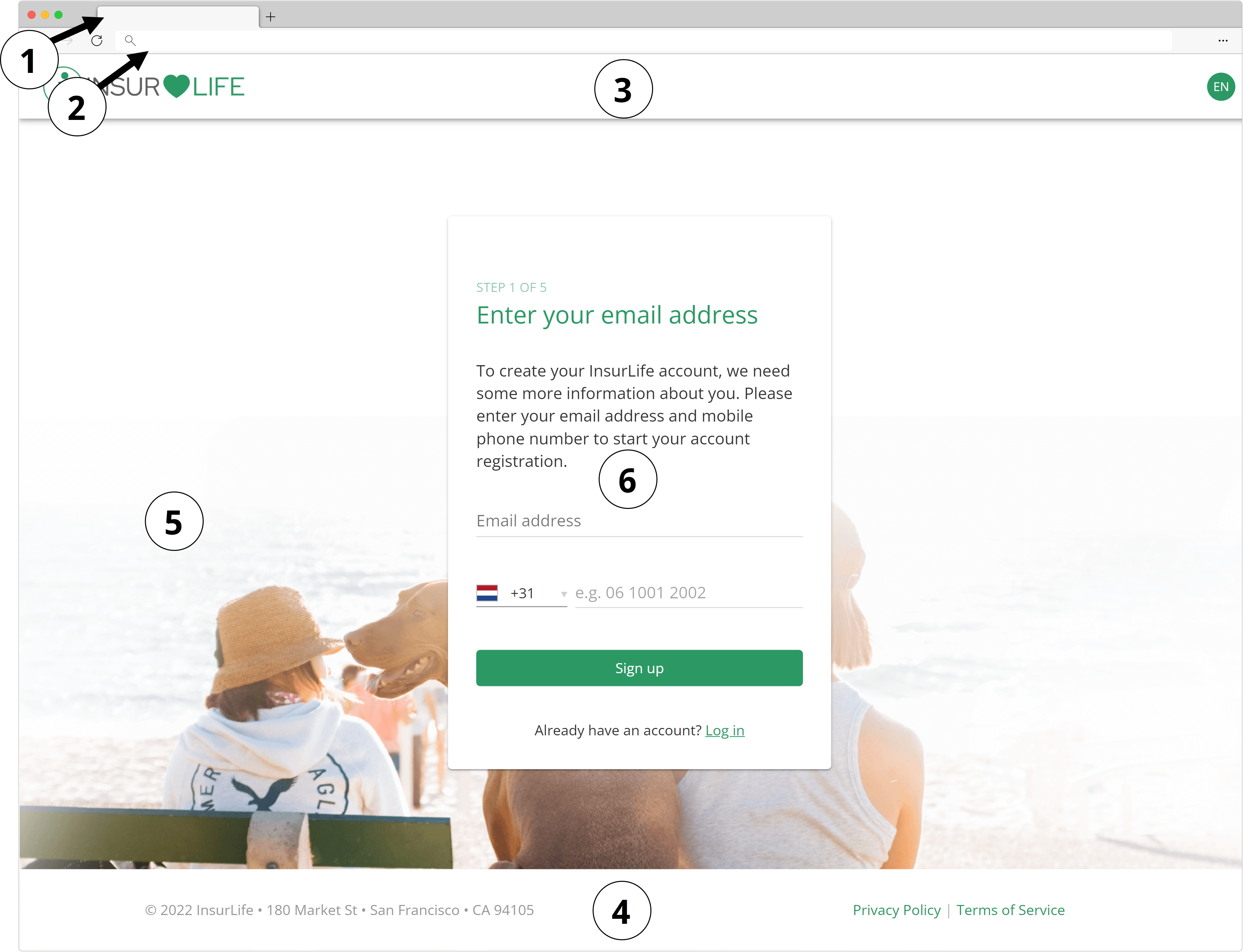
1. Browser Tab
The browser tab of a webpage contains a favicon and a title. The browser tab titles can be unique for each page and can be localised for different languages. Only one single favicon can be used across all pages of a brand.
Browser tab titles are decided upon when you design the user journey with us. For the favicon, provide us with the favicon to be used for your brand.
2. URL
The webpages are hosted on your domain. You can specify the base URL in the user journey workshop.
3. Header
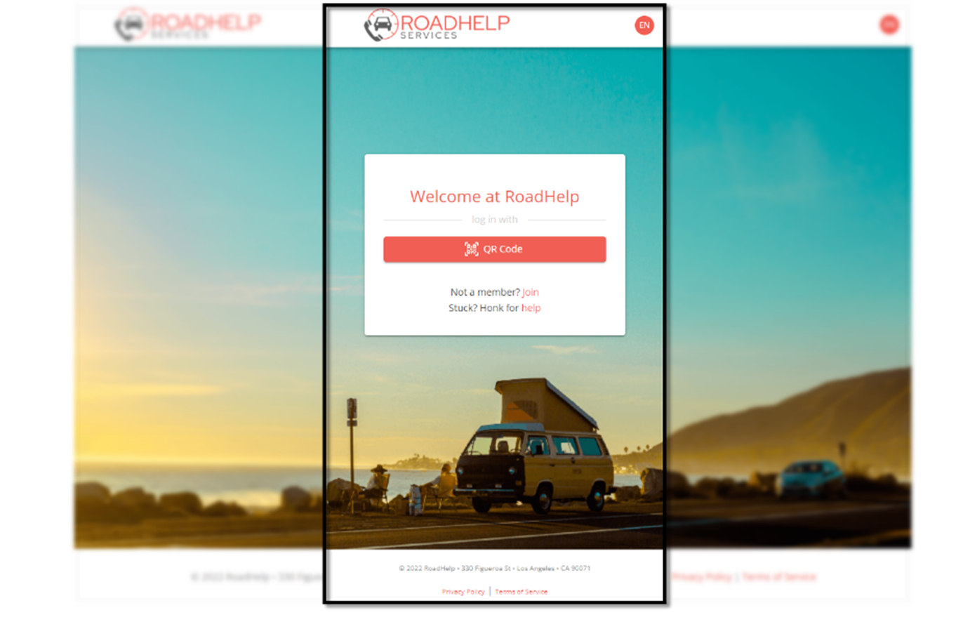
The header is a required element with a customisable background colour but with a fixed position, height (64 px) and behaviour. It contains your logo on the left side and an icon to switch between languages on the right side. The relative location of the two child elements within the header cannot be changed.
Logo
The height of the logo is fixed, i.e. 35 px. Provide the logo image for your brand in either PNG or SVG format. Make sure that the logo (and its background, if non-transparent) fits nicely with the background colour of your header as well as the look and feel of your UI.
Clicking the logo redirects the user to the login page.
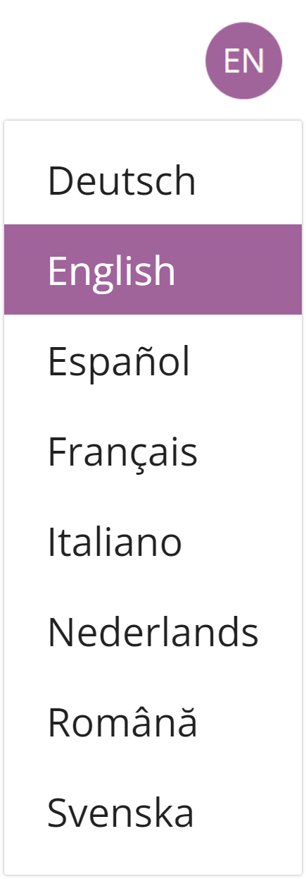
Language Icon
To provide a multilingual experience for your end users, you can display your UI in different languages:
- For English, German, French and Dutch, we provide default text snippets for the UI that you can tailor to your organisation's identity.
- For Italian and Spanish, we provide unofficial text snippets that can serve as a basis for your translations.
- For all other languages, we require the translations from you.
Users can switch between languages by clicking the language icon, which shows a dropdown list with the available languages. The language currently active is indicated in the icon by its two-letter code (ISO 639-1). The font, size and shape of the language icon is fixed, but the background colour can be customised.
Note that when switching between languages in the UI, only the text is changed. It is not possible to have a different look and feel per language.
The admin interfaces, where you manage pages, users and other functionalities, are only available in English.
4. Footer
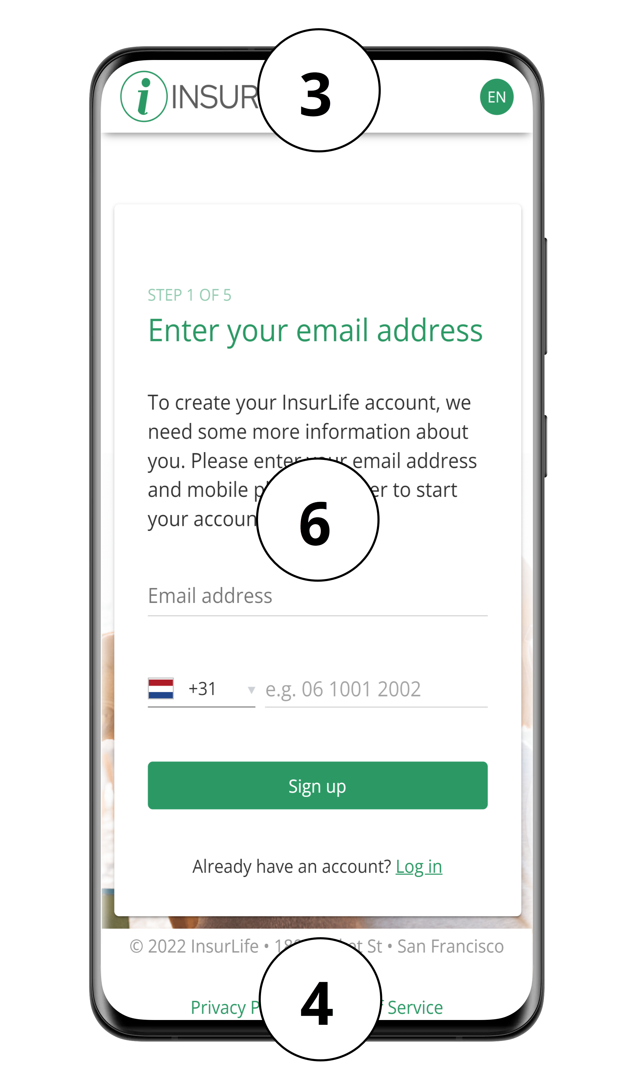
The footer is an optional, responsive element with a customisable background colour but with a fixed position, height (80 px) and behaviour. It can contain up to two text elements with a fixed height, relative width (3/2) and position. The text, font, size and colour of these elements can be customised. The text elements are used to add your company’s contact information and important hyperlinks such as your privacy policy, terms and conditions, and home page.
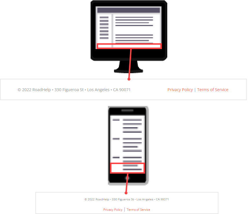
Responsive design: footer display on large screen versus on smaller screens
5. Page Background
You can display your own background image or choose a background colour for your pages. The background can be different for each user flow (e.g. login vs registration), but remains the same within a flow. Provide a high-resolution PNG file or the HEX/RGB code of your choice.
Choose a background image which looks good in a responsive webpage. Smaller screens will only show the centre part of the image.
6. Form Elements
The form is the core element in your UI page. It contains the instructions and options for the end user. The content of the various forms throughout the user journey is determined together with you in a workshop.
Each form is centred on the page and its child elements are vertically stacked (i.e., text fields, input fields and buttons are always displayed in a vertical column). Although the overall structure of the form cannot be changed, each element type within the form can be styled according to your brand’s style guide. These styles then apply for the entire user journey of your brand.
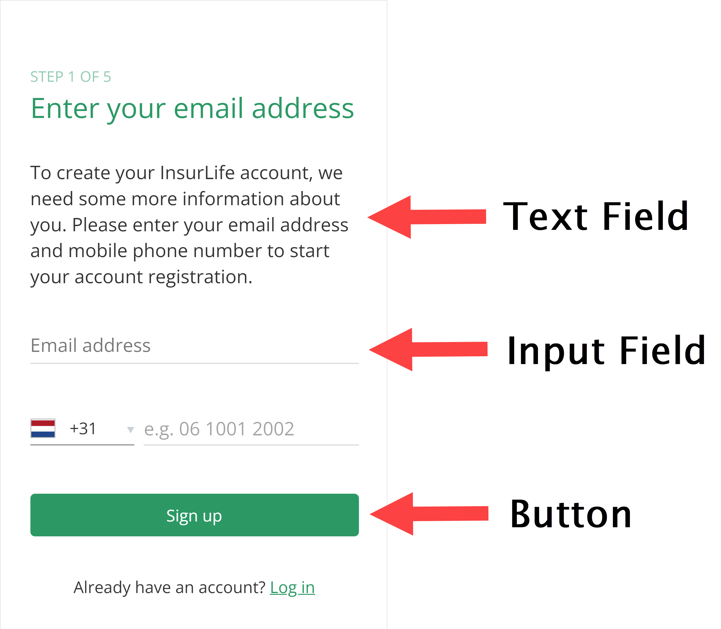
Text Fields
Text fields are used to add headings and paragraphs with, for example, descriptions or alternative options to a form. Each level of the heading elements (h1, h2…) and the paragraph text can receive its own styling regarding font family, font size, text colour and formatting. Moreover, individual words or word groups can be formatted to emphasize their importance and can be assigned a hyperlink.
Input Fields
Input fields collect the data that is requested from a user to, for example, register or log in to your website. These fields can either be optional or required (*) in order to continue a flow of the user journey.
Free Input Field
Our default input fields accept any text input, which can be validated with regex (e.g. digit-only input and formatting validation for telephone numbers).
The behaviour and layout of input fields depend on the interaction of the user.
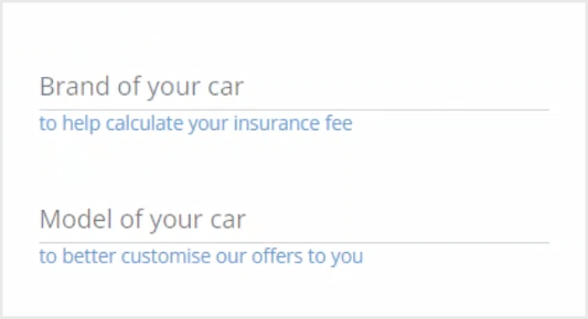
- Before interaction, each free input field contains a customisable, greyed text label describing what the field is for.
- For web users, hovering over an input field can result in a customisable tooltip being displayed below the field. There is no equivalent for mobile users.
- When a field is selected, the label floats upwards and changes colour while the lower border of the field is emphasised by a change in colour. You can customise the colour and font family of the text before and after floating, as well as the colour of the lower border after floating.
- An input field can display a customisable, greyed placeholder text (e.g. oliver.smith@example.com) after the user selects the input field, before they enter any input.
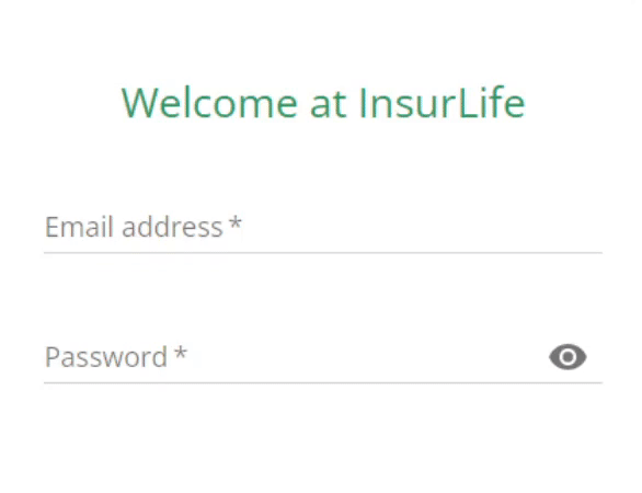
To provide more information about why certain input is needed from the user, you can also make use of consent attributes. A consent attribute appears as a short piece of text below an input field. Their colour can be customised, making them stand out in your form.
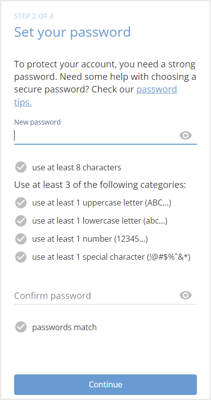
Password Field
A special type of free input field is the password field. The value entered in a password field is masked by displaying a bullet for each character. By clicking the “eye icon”, the user can temporarily visualise this value. This eye icon cannot be changed but can be removed on your request. It is not possible to customise other password-related aspects, such as revealing the last character entered in the password field or displaying a caps lock warning.
When the user chooses a new password, they must retype the password in the confirm password field. This confirm password field can be removed on your request. User passwords can be validated against your company’s password policy. We recommend a password policy that includes the following requirements:
- The password is at least 8 characters long.
- The password satisfies at least three of the following conditions:
- At least one uppercase letter (ABC…)
- At least one lowercase letter (abc…)
- At least one number (12345…)
- At least one special character (}@#$%”&*)
It is also possible to include a password checker that visually informs users whenever their password meets a requirement.
If you require an additional layer of security for your users, it is possible to set up two-factor authentication (2FA). This choice is decided upon when designing the user journey with us.
Other Input Fields
We do not support other types of input fields apart from the specific, predefined use cases listed below. No customisation options are available for said cases.
| Input Type | Use Case |
|---|---|
| Dropdown list |
|
| Checkbox | Consent to privacy policy and terms & conditions |
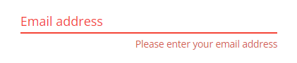
Error Notifications
When the user performs an invalid action, error notifications are displayed.
Error messages are used to inform the user that they have entered incorrect input. A message is displayed underneath the input field while the colour of the label changes to red. Error messages are fixed in design and it is not possible to customise their behaviour or text.
In addition to error messages, pop-up snackbars can be used to display errors. Snackbars appear at the bottom of a screen and provide a brief message to the user. You can edit the text of a snackbar, but not its colour or behaviour.

Lastly, you can also show error notifications as a separately displayed text.
Buttons
Buttons are used to navigate the flow of a user journey. When multiple buttons are provided, the user can choose which flow they want to follow. You can also redirect the user away from the UI.
Buttons have a customisable colour, but their size and shape are fixed. Button text can be customised according to colour and font family, but not font size.
Other
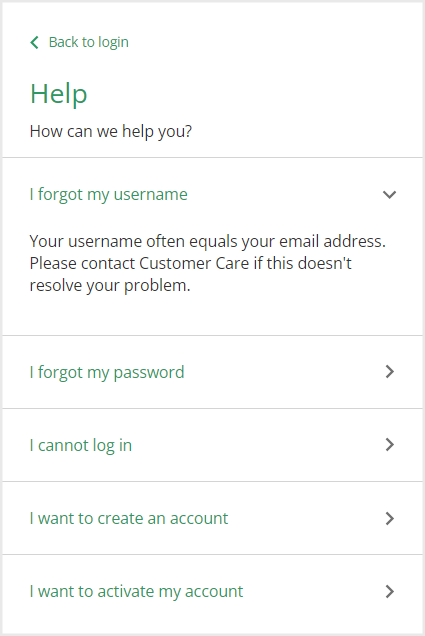
A collapsible section is a special kind of form element, consisting of a title and an expandable section with information. Collapsible sections are exclusively used as a help/FAQ section on a separate page.